Important tool updates - Learn more
- Learn
-
Articles
Read about influencer marketing
-
Growthnotes - Newsletter
Insights for the modern marketer
While most brands chase attention online, print ads still know how to make people stop and look. The best print ads live on the page and stay in your memory longer.
In fact, studies show print advertising has a recall rate 70–80% higher than digital.
And when paired with digital campaigns, print can become 400% more effective. That’s a massive edge for any brand that wants to stay top of mind.
Of course, these results vary by campaign, channel, and the agency building them..
If you're still relying on clicks alone, you're likely missing reach and revenue. Don’t let your next campaign blend in.
In this blog, we’ll cover:
P.S. Thinking of combining print and digital for your next campaign? Smart move. But you might need expert help crafting the creative and making it perform online. That’s where inBeat Agency comes in. From concept to conversion, we help brands develop bold ideas and turn them into high-performing digital campaigns.
Book a free strategy call now and let’s make your message work everywhere it needs to.
Print ads are visual messages designed for physical formats like newspapers, magazines, billboards, or posters. Unlike digital efforts, print advertisements live in the real world, you see them while flipping pages or walking past a bus stop.
They rely on strong graphic design, bold copy, and smart placement to connect with a target audience. A good print ad sticks in your mind, whether it’s clever, emotional, or visually unexpected.
Even with all the noise on social media, print advertisements still know how to grab attention. A great print ad creates a pause. It doesn’t move, but it holds you.
Print media offers something different from digital efforts. It’s physical. It stays visible longer. And it often sticks better in people’s minds.
Because there’s no animation or motion, print forces your creative team to focus on clear messaging, bold visuals, and clean layout. Every visual element has to work harder.
As Roger Dooley wrote in Forbes,
“There's good news for printers and paper companies. Despite the enormous migration to electronic media, neuroscience research shows that paper-based content and ads offer special advantages in connecting with our brains.”
And the data backs it up:
Remember: These figures vary widely by context. Many factors (industry, CTA, demographics) can change this drastically, which is why you need the right performance creative agency by your side.
Today’s best campaigns also connect print to digital. A QR code on a poster, a hashtag in a newspaper ad, or consistent colors and fonts can link your print ad directly to your digital marketing efforts. That way, you guide the target audience through a connected user journey.
The best print advertisements don’t just fill a page. They guide the viewer, deliver a clear message, and leave a lasting impression. A strong concept, sharp layout, and emotional edge can make a simple design unforgettable.
Let’s see what separates standout print advertisements from forgettable ones:
From magazine ads to posters, there are plenty of print ads that fade away. These examples below highlight what makes the great ones work.
Each one offers a clear lesson for copywriters, designers, and anyone shaping a visual message. Use them to inspire your next campaign or rethink your creative approach.
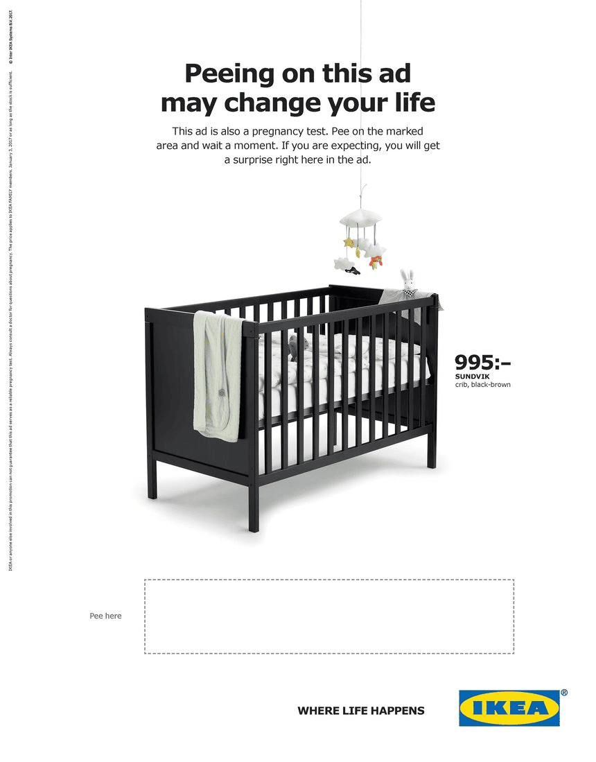
IKEA’s print ad for baby cribs did more than show a product. The ad invited women to pee on the page. If the result was positive, it revealed a discount code for a baby crib.
Wild? Yes. But it worked.
Part of the “Where Life Happens” campaign, the ad ran in a Swedish magazine but made headlines worldwide. It tapped directly into the target audience’s moment of discovery and paired it with an immediate reward.
This print ad proves you don’t need flashy production or a massive rollout. A bold idea, delivered with smart graphic design and a direct call to action, can turn a simple print ad into something unforgettable.
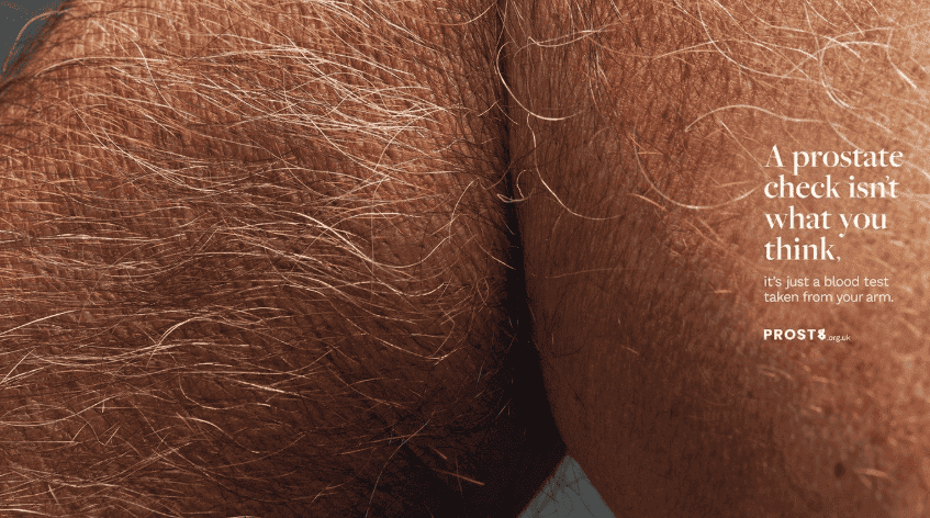
This billboard grabs attention in the most unexpected way. At first glance, the image makes you do a double take, and that’s exactly what Prost8 UK wanted.
Prostate cancer is the most common cancer among UK men, accounting for 28% of all male cancer diagnoses. Around 12,000 men lose their lives to it each year.
Prost8 UK tackled the stigma head-on. The headline reads, “A prostate check isn’t what you think. It’s just a blood test taken from your arm.” And it worked. In just over two weeks, the campaign pulled in 3.2 million organic impressions and 40,000 reactions across social media.
It’s proof that with the right visual message, even a single print ad can shift mindsets and spark national conversation.
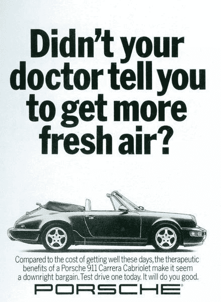
Porsche’s vintage print ad leads with a bold question: “Didn’t your doctor tell you to get more fresh air?” It hooks you instantly. Instead of listing specs or showing off horsepower, the ad frames the Porsche 911 Carrera Cabriolet as a wellness solution.
The headline plays on common advice with a playful twist, while the small print seals the message: driving this car feels good, and that’s reason enough.
This is a great example of how strong copywriting can carry an ad. It’s witty, unexpected, and emotionally engaging. The image stays simple so the message can breathe. It also taps into lifestyle marketing without overselling. You’re not just buying a car; you’re choosing a better mood, better air, and maybe a better version of yourself
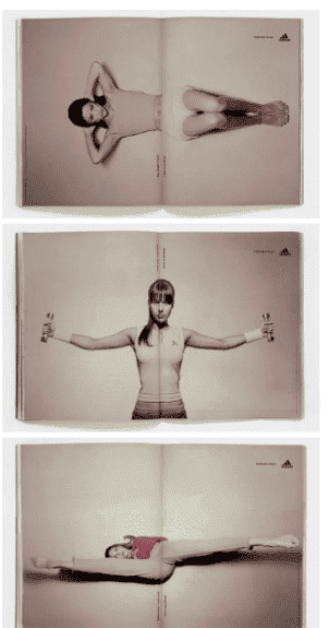
Most brands avoid the center fold in print ads. Adidas turned it into the star. For their Forever Sport campaign, they ran a series of double-page spreads where the athlete’s movement changed as you opened or closed the magazine.
The fold became part of the action, turning a static image into a dynamic, interactive moment. It’s a great reminder that smart graphic design doesn’t always need tech or budget. Sometimes, it’s about using the print format itself as a creative tool.
This ad also strengthens brand awareness by showing how movement, flexibility, and control are all part of the Adidas identity. It’s clever, minimal, and perfectly aligned with the target audience.
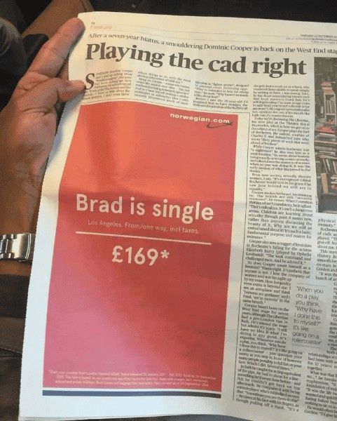
Shortly after news broke about Brad Pitt and Angelina Jolie’s breakup, Norwegian Airlines responded with a clever print ad. Set against a bold red background, the copy read like a dating ad: “Actor. LA. Newly single. Seeks like-minded partner with GSOH.” (That’s short for “good sense of humor.”)
Right below? A one-way fare to Los Angeles for £169. The copy is short, the design is clean, and the message lands instantly. The ad worked because it tapped into a global conversation without being too obvious. It used humor, simplicity, and a smart cultural cue to drive brand recognition.
It also proves that print media isn’t just for evergreen campaigns. With the right creative team and awareness of the moment, even a newspaper ad can feel fast, fresh, and incredibly relevant.
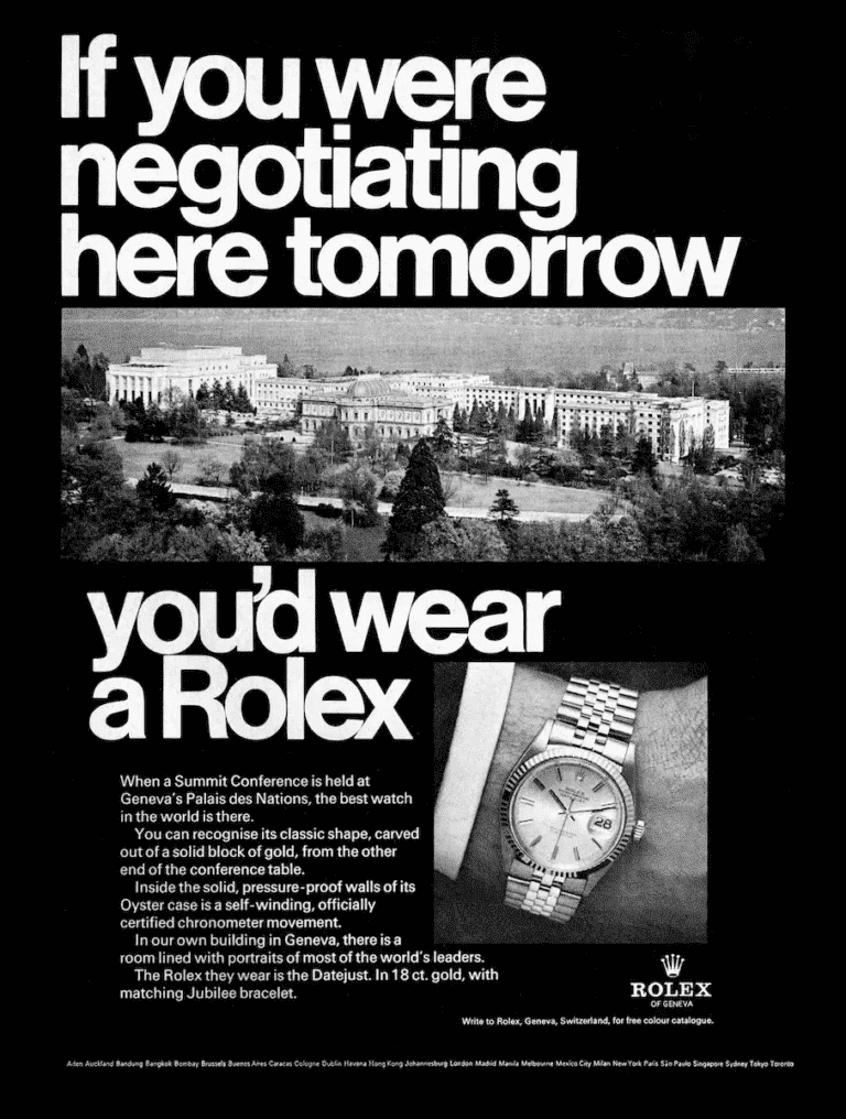
This classic Rolex ad doesn’t rely on flashy visuals or punchy one-liners. Instead, it speaks slowly, confidently, and with purpose, just like the kind of person it’s written for.
The headline sets the tone: “If you were negotiating here tomorrow, you’d wear a Rolex.” The backdrop? Geneva’s Palais des Nations, a symbol of global diplomacy. Below it, a man’s wrist, wearing a gold Datejust.
The message is subtle but strong; this is the watch of serious people doing serious work. While most modern print advertisements go short and sharp, Rolex leans into long copy to tell a story. It brings in history, legacy, and status, all without ever saying the word “luxury.”
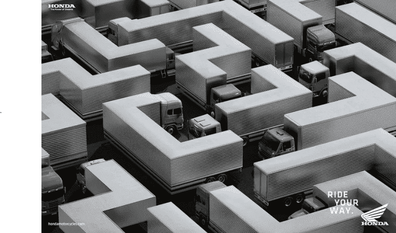
Honda Motorcycles turned everyday gridlock into a statement. In this striking print ad, rows of trucks are arranged like a maze, with sharp corners, blocked paths, and no clear way out. That’s city traffic at its worst.
The message sits quietly in the corner: Ride your way. While cars and trucks could get stuck, Honda riders could find their own route. This ad works because it makes you pause and decode the visual. It doesn’t rely on product shots; it relies on a clever concept.
It’s a solid example of how strong design and simple messaging can cut through, even without showing the motorcycle at all.
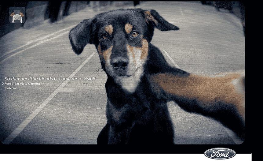
At first glance, it looks like a dog taking a selfie. But this Ford ad, created by Ogilvy Istanbul, is much more than a smart image. It’s an emotional reminder about visibility and safety, especially when it comes to the small lives around us.
The ad promotes Ford’s Rear View Camera. The dog stares directly into the lens, putting the viewer in the driver’s seat. It’s simple, impactful, and quietly powerful. The copy says it all: “So that our little friends become more visible.”
Instead of showcasing tech specs, Ford delivers a message through feeling. This print advertisement connects with the target audience through empathy, not explanation. It turns a car feature into something unforgettable.
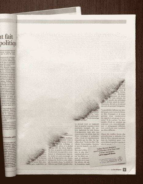
This ad doesn’t shout, it whispers. Created by Publicis for the Belgian League of Alzheimer’s, this full-page print ad is almost blank, except for a faint smudge that looks like words slowly fading off the page.
It’s a quiet but powerful metaphor for memory loss. You don’t need a headline screaming for attention. The concept alone says everything. In the bottom corner, a small note reminds us: “Today, 85,000 Belgians won’t remember what they read in the newspaper. Let’s support them.”
There’s no dramatic photo, headline, or sales pitch. The design itself carries the weight. It reflects the reality of Alzheimer’s with clarity and restraint, using absence to tell a story most people overlook.
This is a strong reminder that print advertisements don’t always need color or complexity. When the concept is right, simplicity makes the impact stronger.
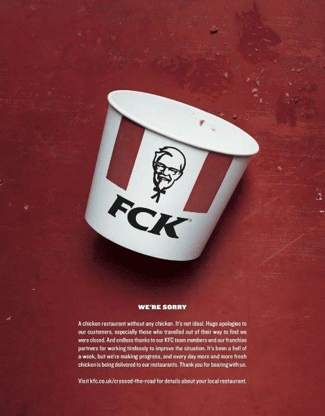
When KFC ran out of chicken in the UK, it was a mess. Stores had to shut down, customers were furious, and the brand took a serious hit. But instead of dodging the backlash, KFC owned it, with humor.
They ran a bold print ad featuring their empty bucket and a new label: FCK. It looked like a typo, but it was a perfectly timed, tongue-in-cheek apology.
The ad went viral. In just three days, it had 8.6 million impressions on Twitter, and same-store sales started climbing again. This is proof that smart copy and humility can go a long way.
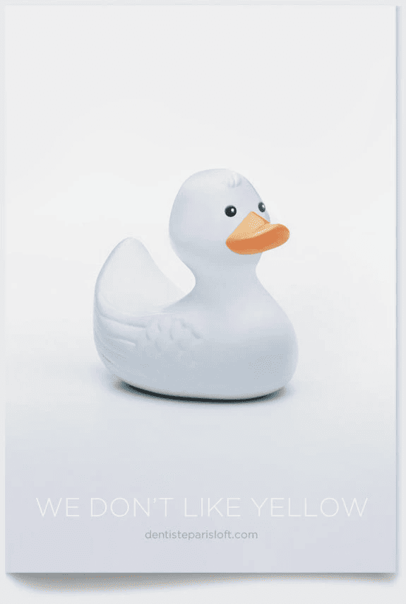
Dentiste Paris Loft used color to make their message impossible to miss. Their teeth-whitening print ads featured objects we all expect to be yellow, bananas, lemons, egg yolks, even a rubber duck, turned completely white.
Next to each image, the line reads: “We don’t like yellow.” That’s it. The visuals do the heavy lifting, and the point lands instantly. It’s a smart example of how to let design speak. The creative team used contrast to make viewers pause, smile, and remember the brand.
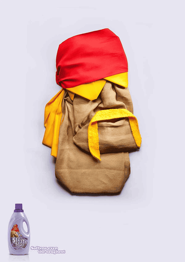
Sta-Soft took a playful route to make its point, and it totally works. In this print campaign, legends like Sylvester Stallone, Hulk Hogan, and Chuck Norris are reimagined as soft fabric dolls.
The tagline says it all: “Softens even the toughest.” It’s quick, funny, and sticks in your head. Instead of showing the product in action, the ad relies on humor and visual metaphor to make its case.
By turning action heroes into cuddly caricatures, the creative team proved that even the most rugged personalities can’t resist StaSoft’s effect. It’s bold, lighthearted, and a perfect example of personality-driven print advertising.
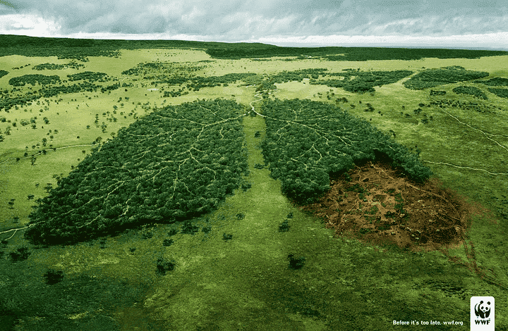
WWF’s “Before it’s too late” campaign doesn’t rely on stats or long explanations. Instead, it uses a single powerful image, a pair of lungs made from tree branches. One lung is healthy and green. The other is dark, dry, and broken.
The visual draws a direct connection between human health and the health of our forests. It’s a simple design, but the message lands immediately: deforestation is destroying the earth’s lungs.
With no headline beyond the tagline, the ad forces the viewer to pause. It’s a bold reminder that climate change isn’t distant. The impact is emotional, visual, and hard to ignore.
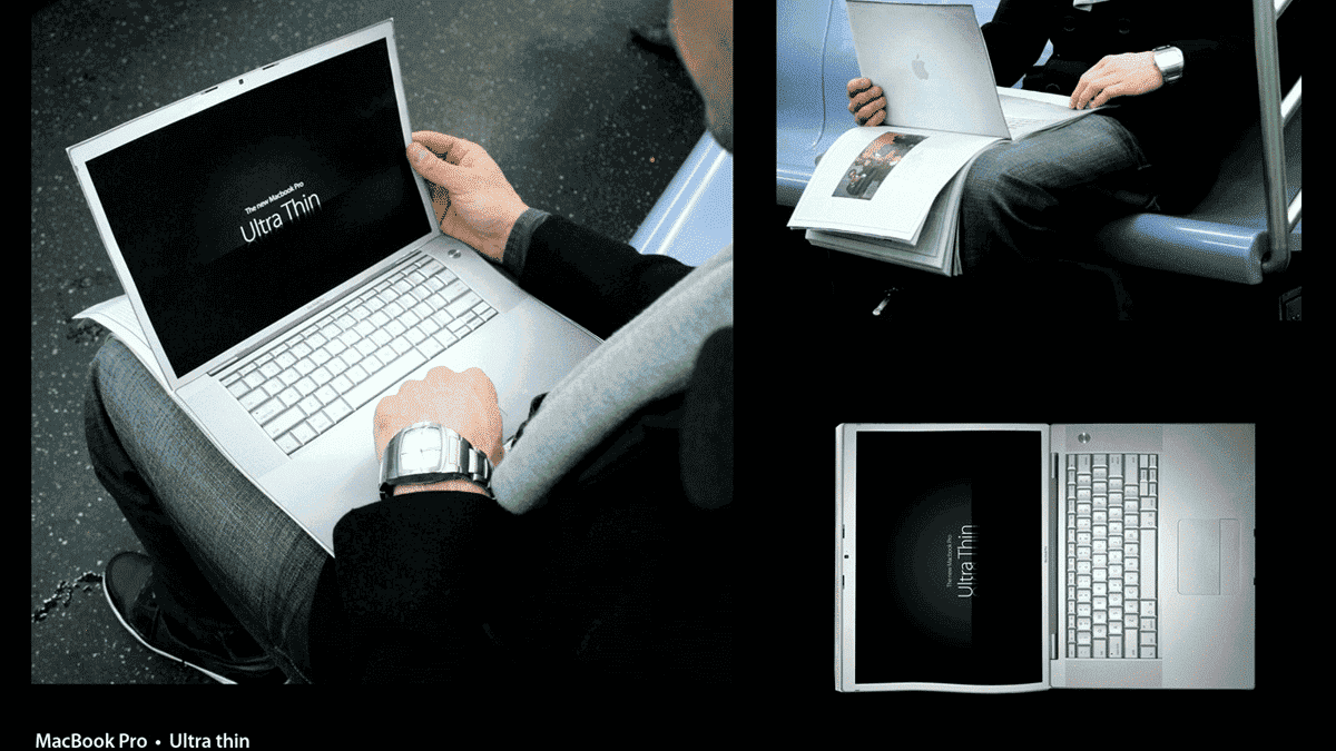
Apple’s MacBook Pro Ultra Thin ad turns a simple magazine into a product demo. Instead of listing features, it lets readers experience them. The ad shows a person holding a MacBook-shaped cutout, designed to blend perfectly with the pages of a magazine, thin, sleek, and easy to carry.
It’s a clever way to highlight the product’s standout feature without saying much. The design does all the talking. Apple has always been about more than tech. This ad speaks to portability, elegance, and everyday ease. It’s the kind of subtle branding that sticks because it feels effortless, and that’s exactly the point.
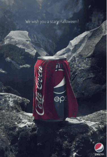
Pepsi’s Halloween print ad took a playful jab at its biggest rival, and made it stick. The visual? A regular Pepsi can wearing a Coca-Cola cape, like a kid dressed up for Halloween. The message underneath? “We wish you a scary Halloween.”
It’s cheeky, simple, and right on theme. The creative team leaned into the well-known rivalry without being mean-spirited. This kind of brand humor works because it feels timely and self-aware. It taps into pop culture, pokes fun, and still keeps the brand front and center. A perfect mix of mischief and marketing.
Burger King is known for its flame-grilled burgers, and apparently, a few real flames too. Instead of hiding the fact that several of their locations have caught fire over the years, they leaned into it.
This print ad features an actual photo of a restaurant mid-blaze, with the line “Flame grilled since 1954” stamped in the corner. It’s bold, darkly funny, and totally on-brand.
By using real fire as part of their messaging, Burger King managed to turn accidents into attitude, and remind everyone what makes their burgers different.

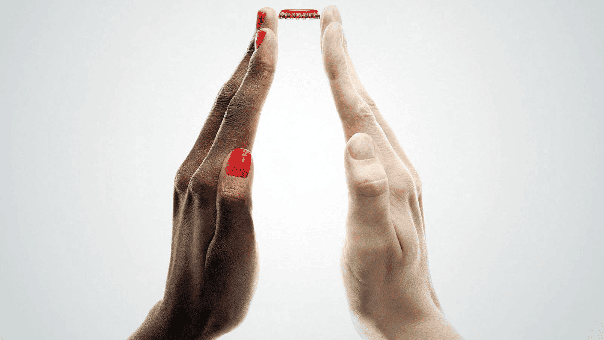
With just two hands and a red cap, Coca-Cola delivers a message bigger than the product. The hands form the familiar bottle shape without any logo. By pairing different skin tones in one simple gesture, the ad quietly celebrates inclusion. No matter who you are or where you're from, Coke belongs on your table too.
It’s clean, universal, and deeply on-brand. Proof that when the idea is strong enough, you don’t need much else to make it work.
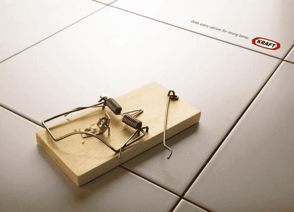
This cheeky ad from Kraft gets its point across with barely a word. A broken mousetrap sits on the floor, with no mouse in sight and cheese crumbs scattered. Clearly, he made a strong escape.
The twist? The trap didn’t just miss; it looks like it was snapped by force. That ties directly to the line in the corner: “With extra calcium for strong bones.” It’s smart, visual, and easy to remember. A perfect example of how one sharp line and a single image can carry the whole message.
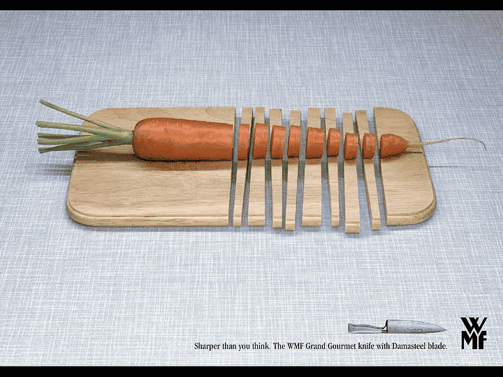
This smart ad from WMF shows off the power of its Grand Gourmet knife without overexplaining. A carrot lies neatly sliced, and so does the wooden chopping board beneath it. That’s the visual punchline.
The knife, made with a Damasteel blade, is designed for precision and power. Every cut in the ad is perfectly aligned, showing just how sharp the tool really is. Even after cutting through wood, nothing looks messy or forced.
The ad shows control, strength, and clean results. It speaks to home cooks and pros alike who want a tool that delivers every time.
This bold JBL ad goes all in on visual storytelling. A calm, smiling listener sits between exaggerated caricatures of Donald Trump and Kim Jong-un, both screaming and clutching red buttons. Chaos surrounds him, but he’s completely at ease.
Why? He’s wearing JBL noise-canceling headphones.
The contrast between the shouting leaders and the peaceful listener nails the product’s promise. No matter how loud, political, or stressful the world gets, JBL helps you stay in your zone.
It’s sharp, funny, and clear without needing explanation. The ad turns global tension into a quirky moment of personal peace, and that’s what makes it stick.

Want your campaign to stick and scale? Start with print to grab attention, and use digital to drive action, track engagement, and retarget like a pro.
Let’s see how to actually combine the two:
When print makes the first impression and digital keeps the conversation going, you build memory and measurable outcomes. That’s a campaign that hits both the heart and the numbers.
Great print advertising is more than nostalgia; it’s a creative tool that still delivers serious impact when paired with smart strategy. The best print ads surprise, inform, or provoke using strong visuals, clean design, and bold concepts that leave a lasting impression.
And when you blend that power with targeted digital campaigns, you get reach, memory, and performance working together.
Key Takeaways
If you’re looking to turn bold concepts into performance-driven campaigns, inBeat Agency can help. From strategy to execution, we turn smart, creative ideas into digital results.
Let’s make something that sticks!
What makes a print ad memorable?
A memorable print ad usually combines strong visuals, clear messaging, emotional tone, and a clever concept. Simplicity and relevance often make the biggest impact.
Are print ads still effective?
Yes. Print ads still drive strong recall and trust. When combined with digital strategy, they can create more memorable, multi-channel campaigns that reach deeper into the audience journey.
How do print ads support digital marketing?
Print builds brand memory and trust, while digital delivers reach, engagement, and data. Together, they create a complete funnel, from awareness to conversion.
What are some common types of print ads?
Magazine spreads, posters, billboards, direct mail, and packaging inserts are common print formats. Each can serve different goals depending on the message and audience.
How can I measure the impact of a print campaign?
Use unique QR codes, short URLs, and regional targeting to track performance. Pair with digital retargeting to measure engagement beyond the page.
Is it expensive to run a print ad campaign?
Costs vary based on placement, size, and production. However, strategic print ads often deliver high ROI when paired with digital touchpoints.